GRIC Brand Proposition
Global Risk & Internal Control Brand Proposition
Objectives
With informed risk decisions increasingly critical to strategic realisation, the GRIC (Global Risk & Internal Controls) team commissioned us to define their proposition and reinforce their reputation as trusted risk partners across the business — positioning GRIC as vital value-chain contributors and ensuring complex communications are distilled into clear, compelling messages that land with the stakeholders whose buy-in matters most.
‘GRIC’ Value Proposition
How We Did It
Working closely with the GRIC leadership team, we took a structured approach — beginning with discovery to fully understand the function’s purpose, remit, and ambitions before shaping a proposition that was authentic, compelling, and built to endure.
From there, we developed a cohesive brand identity and digital presence designed to elevate GRIC’s profile, improve cross-functional relations, and position the function as the first port of call for best practice risk management across the business.

Deliverables
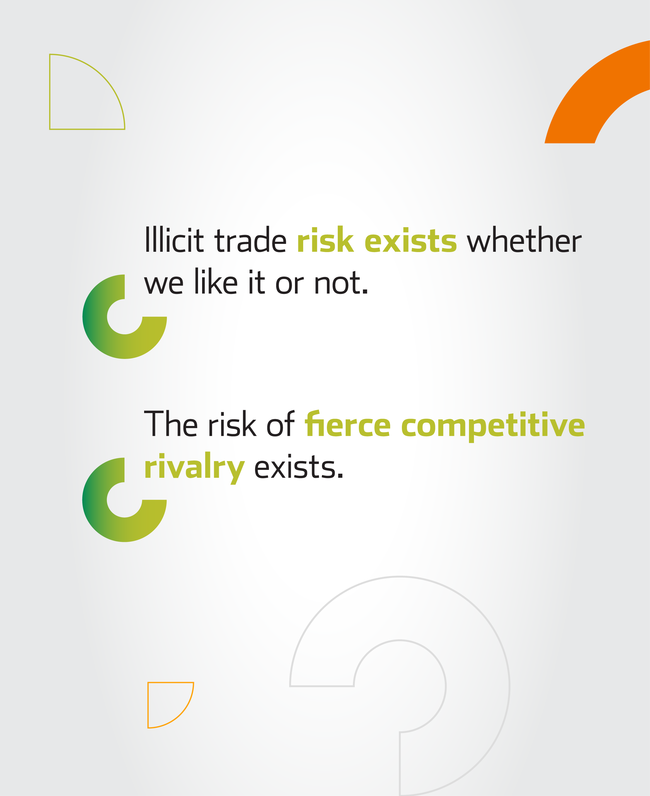
A discovery workshop surfaced the insights needed to craft a value proposition and strapline centred around Managing Risk with Confidence — a clear, assured positioning that captures both the function’s purpose and the reassurance it delivers to the business.
A structured messaging framework gave the GRIC team a practical tool to deploy across all touchpoints – highlighting GRIC’s expertise in managing the risk landscape to instil confidence, framed to resonate with each target audience.
The value proposition was visually interpreted through a logo identity and supporting PPT slide deck assets, with a brand book guiding consistent roll-out.
‘GRIC’ Brand Messaging
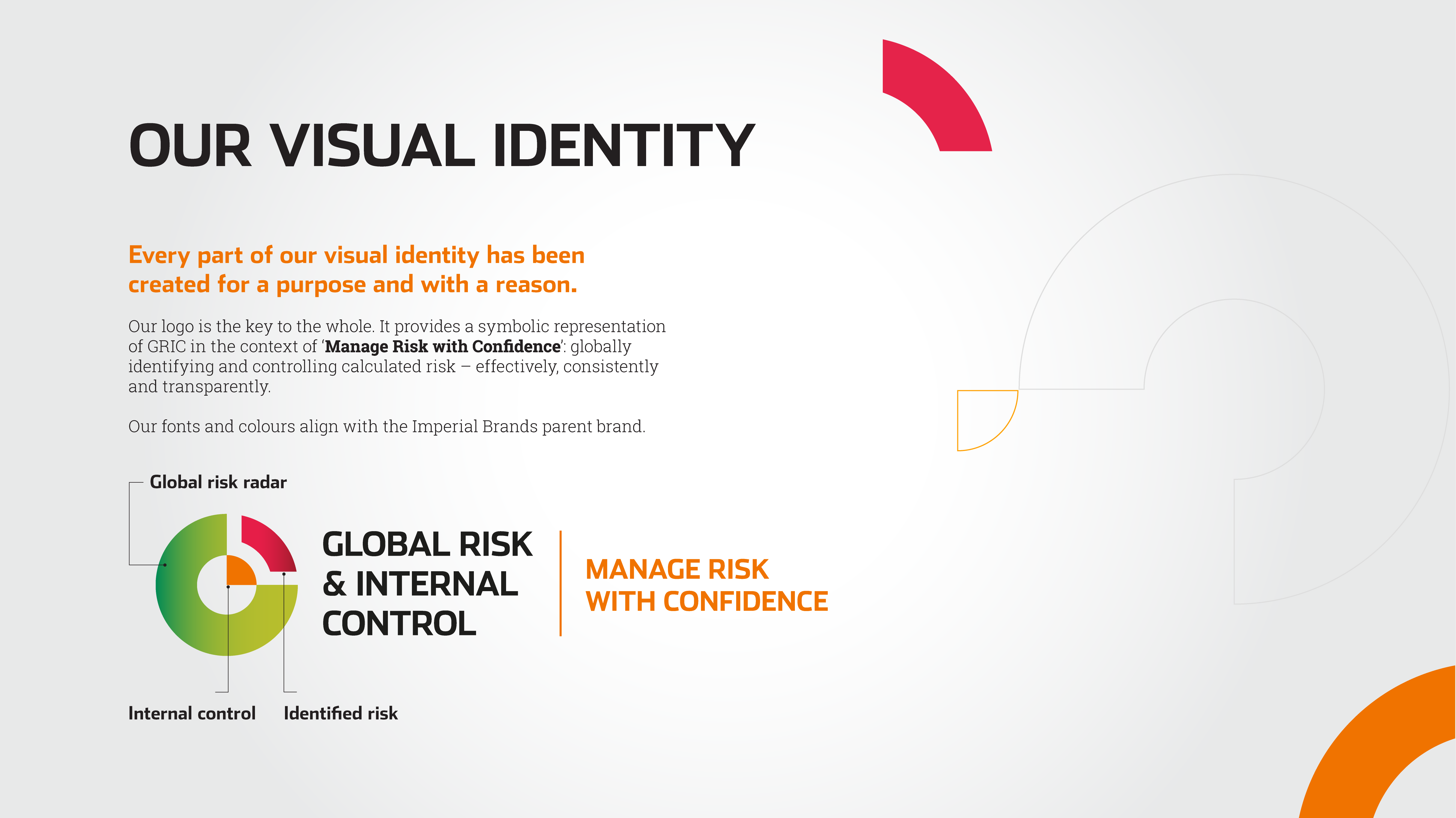
The brand identity embodies GRIC’s commitment to globally identifying and controlling calculated risk — effectively, consistently and transparently — with the brand mark bringing this to life through a global risk radar, identified risk and internal controls, represented in green, red and orange respectively; the latter a deliberate nod to Imperial’s primary brand colour-way, rooting GRIC’s identity firmly within the broader corporate family.
Online, GRIC’s SharePoint presence was transformed to align with the new positioning – with content planning shaping key sections and navigation to intuitively direct users to the content and calls-to-action most relevant to them.
‘GRIC’ SharePoint Template